

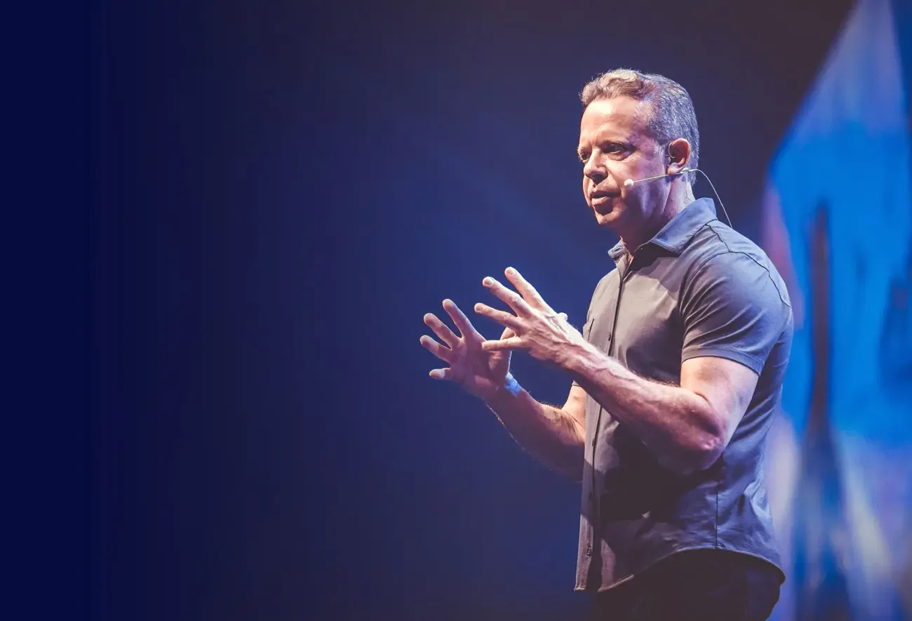
 NewJoe Dispenza
Event · Basel
Progressive Retreat in Basel
A retreat for your new future.
was 799 €599 €
 Brand Guidelines
Version 2.0 · November 2026
Logo, colors, typography, imagery, design elements, icons, UI, tone of voice and applications. For everyone who designs or writes for younity.
This guide describes how younity looks and sounds. It applies to everyone who designs or writes for younity, internally and externally.
The basic rules in brief. Details and reasons follow in the chapters.

Logo
Wordmark in gradient on white. Symbol for avatars and watermarks. Never combine them.
Colors
Space Blue carries the brand, Deep Pink sets accents. Plenty of white and light surfaces create calm.
Typeface
DM Sans for everything. Headlines in Bold with tight tracking, body text in Regular.
Signature
One keyword in pink, at most once per format. No all caps.
Shape
The circle from our symbol. Arch, pill and half circle derive from it.
Tone
We write warmly and concretely and make no healing promises.
What younity stands for, why we exist and how we want to come across.
Our claim
The claim speaks to every person directly. Like our name, it is written in lowercase, without a full stop and on one line. It stands on its own, not as a fixed unit with the logo.
Vision
Empowering people to be fulfilled.
We do it with love and passion.
Mission
With love and passion, we create valuable experiences, open up access to the most inspiring mentors and share their wisdom.
We enable people to connect with their higher self and unfold their full potential.
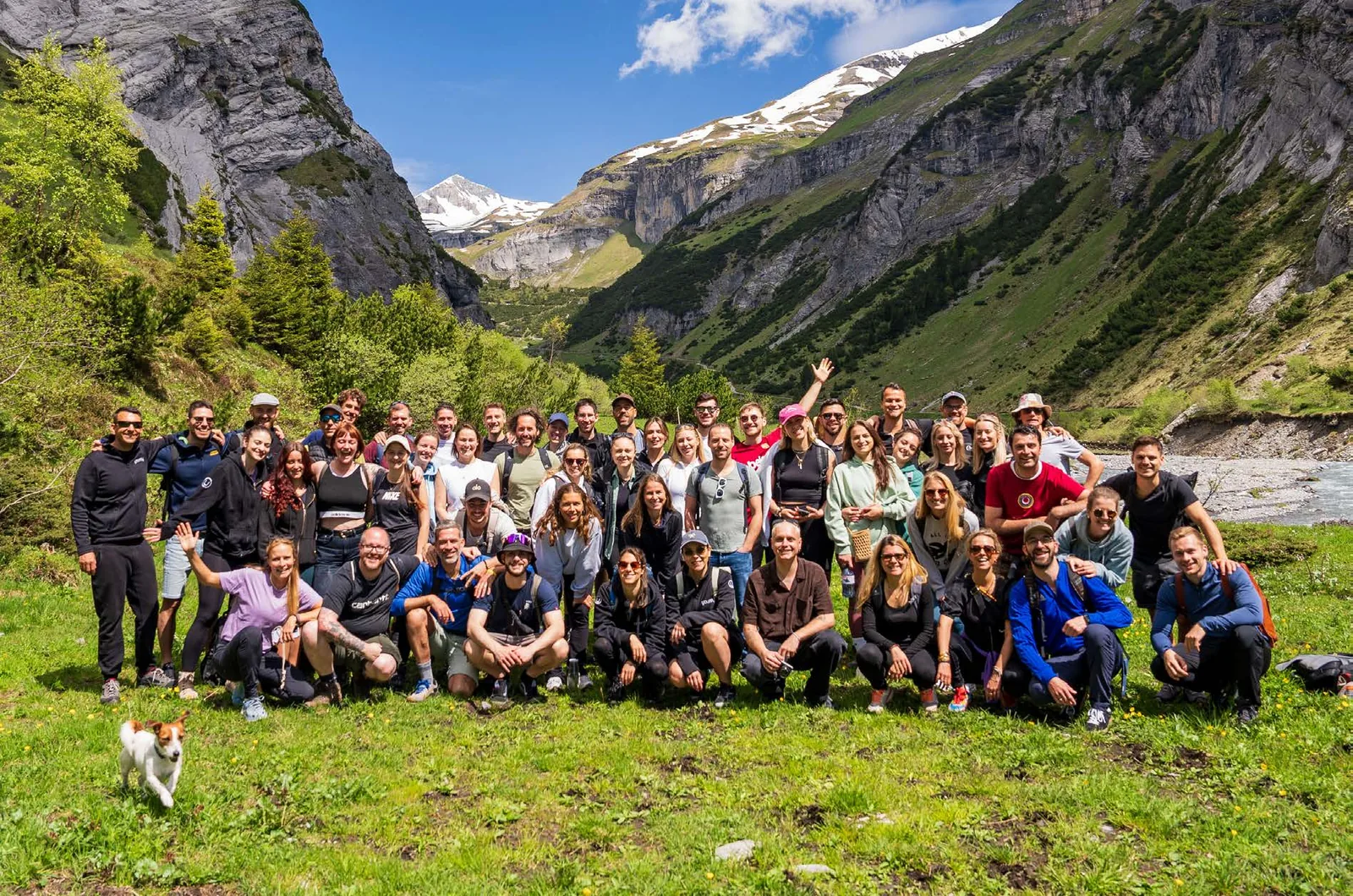
younity turns the wisdom of the most inspiring mentors into experiences people can buy, attend and live: online programs, masterclasses, trainings, online summits, live events and communities.
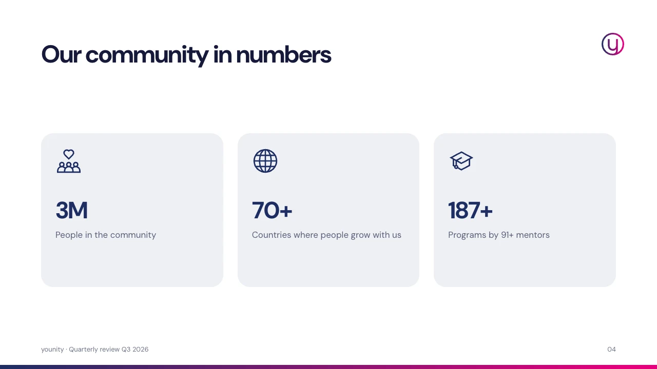
In 14 languages and more than 70 countries. Based in Muttenz, Switzerland.
Figures as of November 2026. Check before use.
Three qualities from the first guide of 2024. They apply to all channels.
mindful
We act with care and conviction. We choose mentors, content and words carefully.
empowering
Every piece of content should enable a concrete next step.
valuable
We would rather do less and do it thoroughly. What we offer should have a lasting effect.
We are
We are not
Our most important identifier. It consists of two independent marks: the wordmark and the symbol.
The wordmark is a reduced, geometric typeface. The symbol is the initial y, enclosed by a circle that its descender connects to.
Wordmark · primary logoFirst choice for every sender: website, documents, posters, presentations.
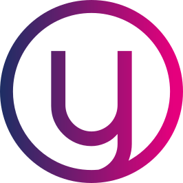
Symbol · signetFor small spaces and wherever younity is already clear as the sender.
Important: Wordmark and symbol always stand alone. They are never combined side by side into one logo, not even in headers or email signatures.
The gradient version is our primary logo. The single-color versions are used when the background or production method does not allow the gradient.
GradientPrimary logo on white and very light, calm surfaces.

Space BlueOn light surfaces when the gradient is not possible.
WhiteOn Space Blue, pink, dark surfaces and photos.

Deep PinkAs an accent on white, light surfaces or black.

BlackOnly for single-color print, stamps, engraving or very busy light surfaces.
File formats: SVG for web, Office and print (scales without loss). PNG with a transparent background for tools without SVG support. Never use logos from screenshots or JPGs with a background.
The clear space keeps other elements at a distance. It grows with the logo and is therefore defined relatively, not in pixels.
Wordmark: x = half the height of the letter “o”That is roughly 9 % of the logo width.
Symbol: x = ¼ of the circle diameterApplies on all sides, including the format edge.
The symbol is used where space is limited or the brand is already known: profile picture, app icon, favicon, watermark in social media and on slides.
GradientDefault on white

Space BlueLight surfaces
Deep PinkAccent on light

WhiteDark surfaces, photos
White on pinkAction surfaces
App iconAvatar, Favicon
Profile picture: App icon version, circular, identical on all social channels.
Watermark: in posts and thumbnails top right or top left, about 8 % of the format width.
Slides: top right on light content slides. Title and chapter slides carry the wordmark.
Rule of thumb: gradient on white, white on dark. On photos, the logo always sits in a calm area of the image.
WhiteGradient
Light BlueGradient or Space Blue
Light PinkSpace Blue
Space BlueWhite
Deep PinkWhite
BlackDeep Pink or white
Dark photoWhite in a calm area
Light photoBlack or Space Blue
The logo is always used from the original files. It is never redrawn, altered or given effects.
Do not distortAlways keep the proportions.
Do not rotateThe logo always stands upright.
No effectsNo shadow, glow or 3D.

No outlineOnly the original filled shapes.
No gradient on darkThe white version belongs here.
No pink on Space BlueNot enough contrast.
Do not recolorOnly the five approved versions.
Do not combineSymbol and wordmark stay separate.
younity is the stage. Our formats put the mentors and their content in focus, the logo signs off as the sender.
Dashed: margin of 7.5 % of the format width, so 80 px at 1080 px. The symbol sits in the top left margin.
Co-branding with partners
Partner logoTwo brand colors, plus light surfaces and a small palette for digital states.
For spot color printing, use the Pantone values; for four-color printing, the CMYK values. Check CMYK with a proof before every job.
Light Blue and Light Pink are the stage for portraits and content. We use the extended palette only digitally, for states and text.
Digital extension · screen only, not for print
The gradient from Space Blue to Deep Pink is part of our logo. To keep it special, we use it in only one other place: as a thin bar.
Linear · 90° (left to right) · CSS: linear-gradient(90deg, #1D2E64 0%, #E5007D 95%)
Allowed
Not allowed
White and light surfaces dominate, Space Blue gives structure, pink stays rare.
A guideline across a campaign or website. Individual formats (e.g. an event poster in Space Blue) may differ.
How we combine
On Space Blue: pink as a surface always, as type only in headlines from 32 px.
What we avoid
Too little contrast, muddy pairings or the gradient as a surface.
We meet WCAG 2.2 level AA: at least 4.5 : 1 for text, 3 : 1 for large type from 24 px (or 19 px bold) and for controls. The only deliberate exception: the pink keyword in large headlines on Space Blue.
One typeface for everything: DM Sans. Plus weights, scale, typesetting rules and the pink keyword.
Aa
DM Sans
Geometric sans serif with low contrast, free under the SIL Open Font License. Available via Google Fonts, self-hosted on the website.
0 1 2 3 4 5 6 7 8 9
Aa Bb Cc Dd Ee Ff Gg Hh Ii Jj
Kk Ll Mm Nn Oo Pp Qq Rr Ss Tt
Uu Vv Ww Xx Yy Zz Ää Öö Üü
& ? ! „ “ € % @ ( ) · → +
Fallback: Arial, Helvetica, sans-serif. Install DM Sans for Office templates. Where that is not possible (e.g. email clients), Arial is used.
Five weights with fixed roles. That is all we need.
Bold 700Tracking −2 % to −3 %
Headlines, statistics, prices, emphasis in body text
For a fulfilled life
Semibold 600Tracking 0 to +1 %
Buttons, card titles, navigation, labels
Start for free →
Medium 500Tracking 0
Names, subtitles, meta lines
Shi Heng Yi · Shaolin master
Regular 400Tracking 0
Body text, leads, descriptions
Online programs, masterclasses and live events.
Light 300from 64 px only
Large chapter numbers and single display words, never for text
01 02 03
Desktop values. On mobile, we scale display to H2 down to about 70 %: H1 36 px, H2 28 px, body text 16 px.
Our typographic signature comes from the first guide: one word in pink. It only works as long as it stays rare.
The stage for the most inspiring teachers of our time
On a light backgroundOne word in Deep Pink
The spiritual festival in Europe
Info and ticketsOn Space BlueOne large word in Deep Pink, small type stays white
One word
The emotional core word of a statement, never a whole sentence. Same weight, only the color changes. On Space Blue also Deep Pink, but only in headlines from 32 px.
Rare
At most once per format or screen, in the most important headline. Subheadings and page titles stay single-colored.
No all caps
No lines in capitals above headlines. Categories appear as a meta line in normal case: “Online course · 21 days”.
Don’ts
No shadows
No outline
Do not distort
No gradient in type
No all caps
Not several colors
Portraits, events, community and nature. Plus image shapes, color overlay and illustrations.
Four groups of motifs we focus on.
Real moments
Real people and real emotions. Community you can feel.

Approachable mentors
Eye contact, warm light, calm background.
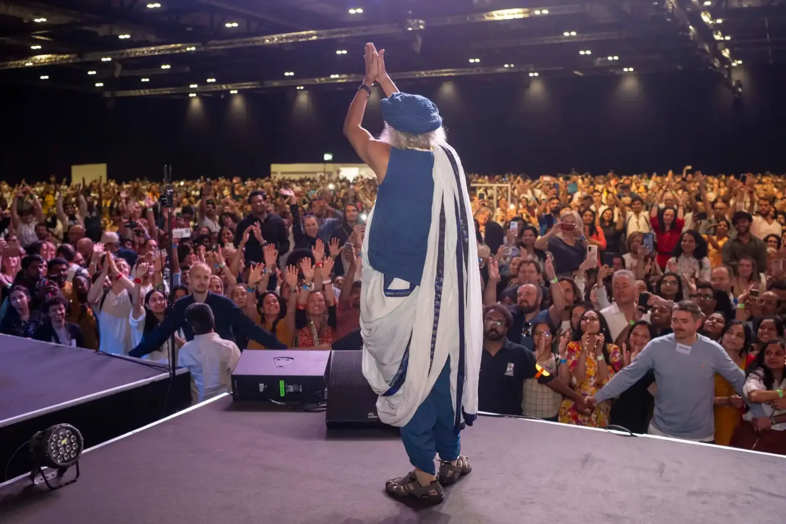
Energy of the stage
Connection between stage and audience, light and movement.
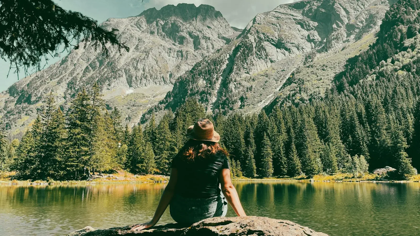
Light and space
Nature, sky and water: room to breathe and arrive.
Portraits are our most important motif. They sit on Light Blue, Light Pink or white and are cropped in an arch or circle.
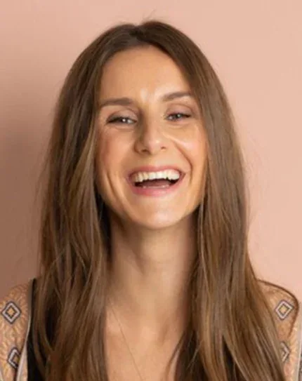


 Joe Dispenza
 Anita Moorjani
 Bruce Lipton
 Gregg Braden
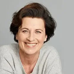 Eva-Maria Zurhorst
Besides portraits, three motif worlds tell the younity story: the power of live events, the warmth of the community and the vastness of nature.
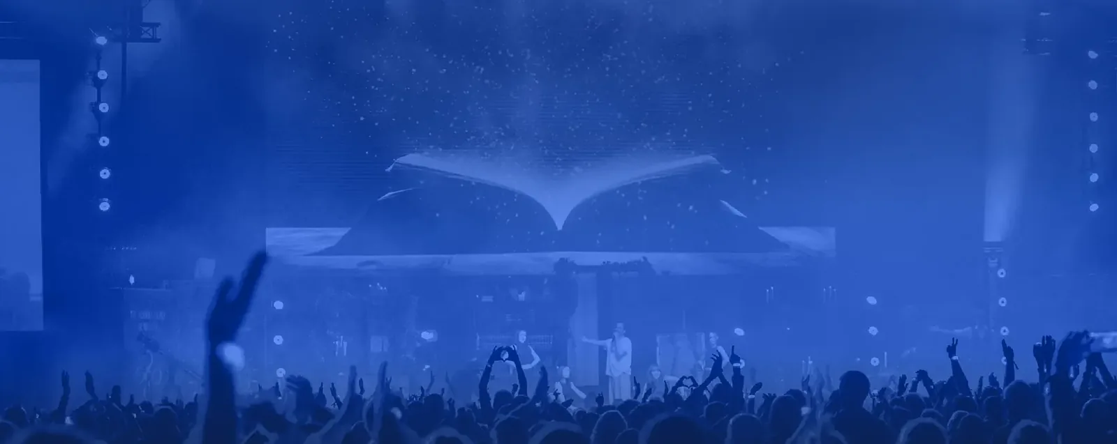
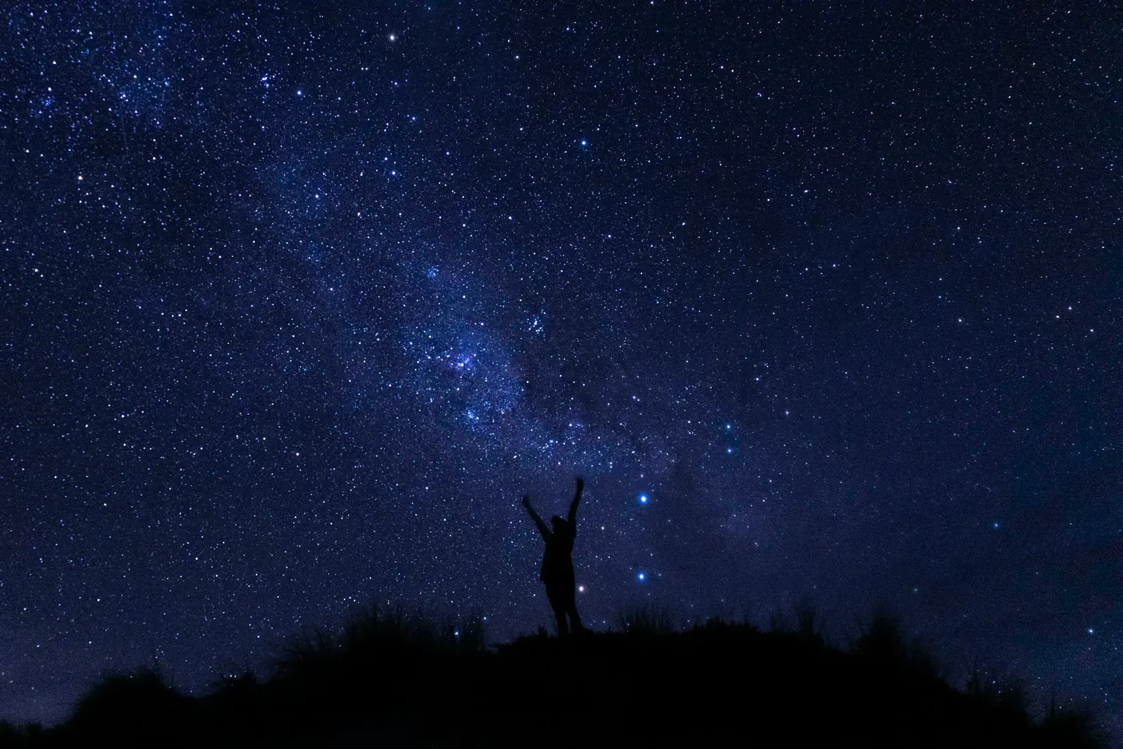
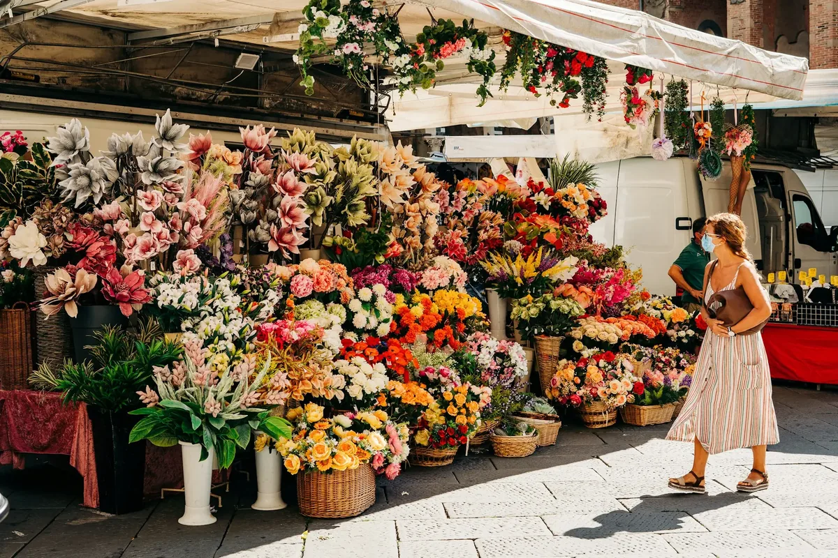

Images are placed in our family of shapes. Large background images with text get the color overlay.
Image shapes
Circle for avatars · Arch for portrait cards · Rectangle with 24 px radius for photos.
Editing
Color overlay
OriginalWith overlayThe overlay is a tool for photos, not the logo gradient. It is never applied to portraits.
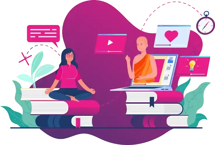
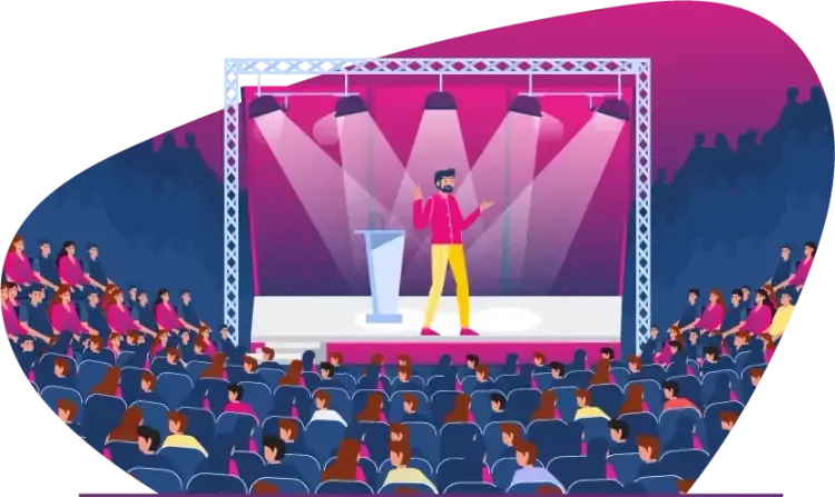
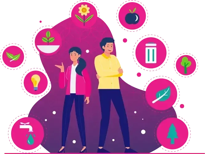
Our illustrations explain offers, processes and values. They are flat, friendly and kept in our palette.

Style
Flat shapes without outlines, figures in pink and blue tones, an organic shape from pink to violet as the stage.
Use
Offer categories, onboarding, sustainability, explanatory graphics, empty states in apps.
Limits
Never as a replacement for mentor photos. Do not mix in other illustration styles. Commission new motifs in the existing style.
The circle from our symbol is the origin of every shape we use.
The circle stands for unity, for perfection and the all-one. As a line without beginning or end, it stands for infinity and return; as a ring, for protection and connection.
It comes directly from our symbol. A small family of shapes emerges from it, which we use as image masks, surfaces or accents.
Three ways to use them. One per format is usually enough.

Orbit
younity at the center, the mentors circle around it. For hero areas, title pages and events. Rings 1 to 2 px in white at 8 to 12 % opacity.
Image mask
Arch and circle frame portraits and photos. They give images warmth and connect them to the symbol.
Accent
Shapes cropped at the edge and the pink accent line above numbers and names. At most two shapes per format.
Shapes in Space Blue, Deep Pink, Light Blue, Light Pink or white. No gradient, no shadow and no outline, except for the orbit rings.
Many websites and posts made with templates or AI tools look the same. These patterns make younity interchangeable. We do not use them.
YOUR PATH TO TRANSFORMATION
Transform your entire life
Not just any course, but your journey. Clear, powerful, transformative.
TemplateBadge, all-caps line, glow, two pink spots, empty phrase, two equal buttons
The best mentors for a fulfilled life
Online programs, masterclasses and live events with more than 90 mentors.
Start for freeyounityOne clear statement, one pink word, one button, own shape
Brand icons for content, UI icons for controls.
Monoline, with a consistent stroke width. For benefits, program content, presentations, print and social media.
On the website and in digital products, we use Phosphor Icons in the Bold style. They are optimized for user interfaces, freely licensed (MIT) and cover all controls.
Sizes 16, 20 and 24 px. The color follows the text color (currentColor). Source: phosphoricons.com
Components, spacing and tokens for website and digital products. Pink marks what is clickable.
Each section has exactly one primary button. Buttons are always pill-shaped and carry a verb.
Primary
Secondary & link
On Space Blue
Labels
Short and active, with a verb: “Start for free”, “Info and tickets”. Not: “Click here”, “Submit”.
Hierarchy
Primary for the main action, secondary for alternatives, link for further content.
Motion
On hover, the button rises by 1 px. Transitions 240 ms, easing cubic-bezier(.16, 1, .3, 1).
Form fields are pill-shaped like buttons. Badges and chips help with orientation without cluttering.
I accept the privacy policy and would like to receive the younity newsletter.
Badges
Meta line and rating
Names and mentor chips
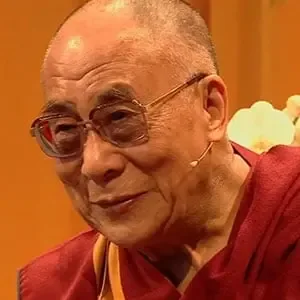
Bruce Lipton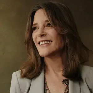 Marianne Williamson
Cards have a 24 px radius, a thin border instead of hard shadows and always follow the same order.
NewJoe DispenzaEvent · Basel
A retreat for your new future.
Video teachings, live coaching and a community.
Try it without risk.
“I have grown so much as a person.”
Product card: Image with badge and name pill → meta line → title (H3) → short text → footer with arrow and price. Prices and content in this example are placeholders.
All spacing follows a 5-point grid. There are two radii plus the pill, and two shadows.
Spacing
Radii
Shadow
All values in this guide are available as CSS variables. They can be used directly in websites and apps.
/* younity Design Tokens 2.0 (excerpt) */ :root { --yn-space-blue: #1D2E64; --yn-deep-pink: #E5007D; --yn-light-blue: #EEEFF4; --yn-light-pink: #FCE7F2; --yn-pink-hover: #C8006D; --yn-text-on-dark-muted: #CFD4E6; --yn-ink: #16193A; --yn-gradient-brand: linear-gradient(90deg, #1D2E64 0%, #E5007D 95%); --yn-font: "DM Sans", Arial, Helvetica, sans-serif; --yn-fs-h1: 48px; --yn-lh-h1: 54px; --yn-fs-body: 17px; --yn-lh-body: 28px; --yn-tracking-tight: -0.02em; --yn-radius-sm: 12px; --yn-radius-lg: 24px; --yn-radius-pill: 999px; --yn-shadow-button: 0 10px 24px -10px rgba(229,0,125,.55); --yn-ease: cubic-bezier(0.16, 1, 0.3, 1); }
We speak directly, write concretely and never promise what we cannot keep.
Four principles, each with an example.
Personal
We address every person directly.
Like thisStart your journey.
Not like thisUsers may now begin their personal transformation journey.
Warm
We show feeling and stay grounded.
Like thisFind your way back to inner calm.
Not like thisImmerse yourself in the infinite bliss of the universe!
Clear
We state facts and avoid jargon.
Like this8 days, free, at your own pace.
Not like thisA multidimensional experience on every level.
Honest
No healing promises, no false urgency.
Like thisMany participants experience more calm.
Not like thisCures your anxiety in 7 days. Today only!!!
| We say | Instead of |
|---|---|
| Mentors | Gurus, coaches, speakers |
| Online program, online course | Product, content, package |
| Community, participants | Customers, users, target group |
| Journey, path, growth | Optimization, hack, upgrade |
| Fulfilled life | Perfect life, success at any cost |
| Free | Gratis, for nothing |
| Live event, festival | Seminar event |
Examples for website, social media, video, print, email and presentations.
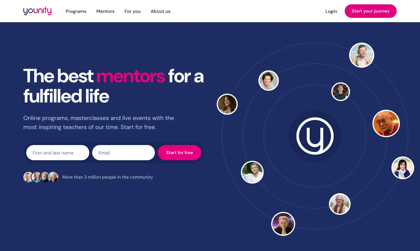
Hero in Space Blue with orbit, one headline with a pink word, a clear call to action, cards with 24 px radius and plenty of white space.
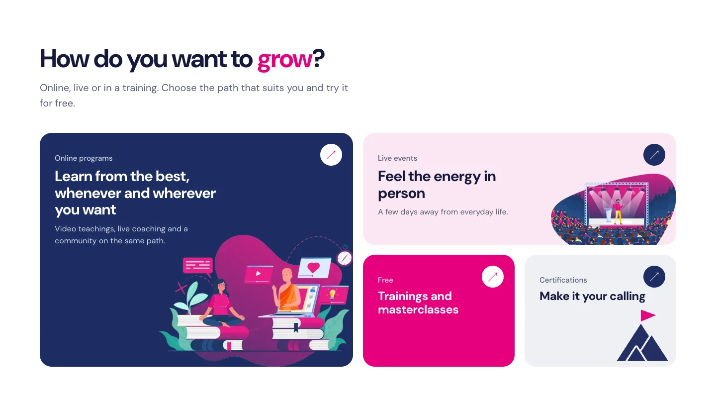
One message per post, at most one call to action. The symbol sits as a watermark in a top corner.
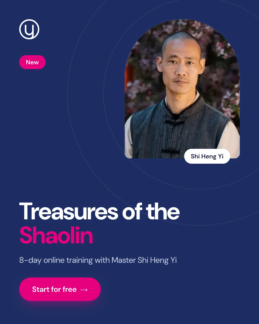
Announcement · 1080 × 1350 · Space Blue, portrait in an arch
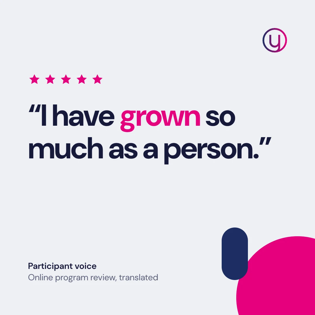
Community voice · 1080 × 1080 · real review
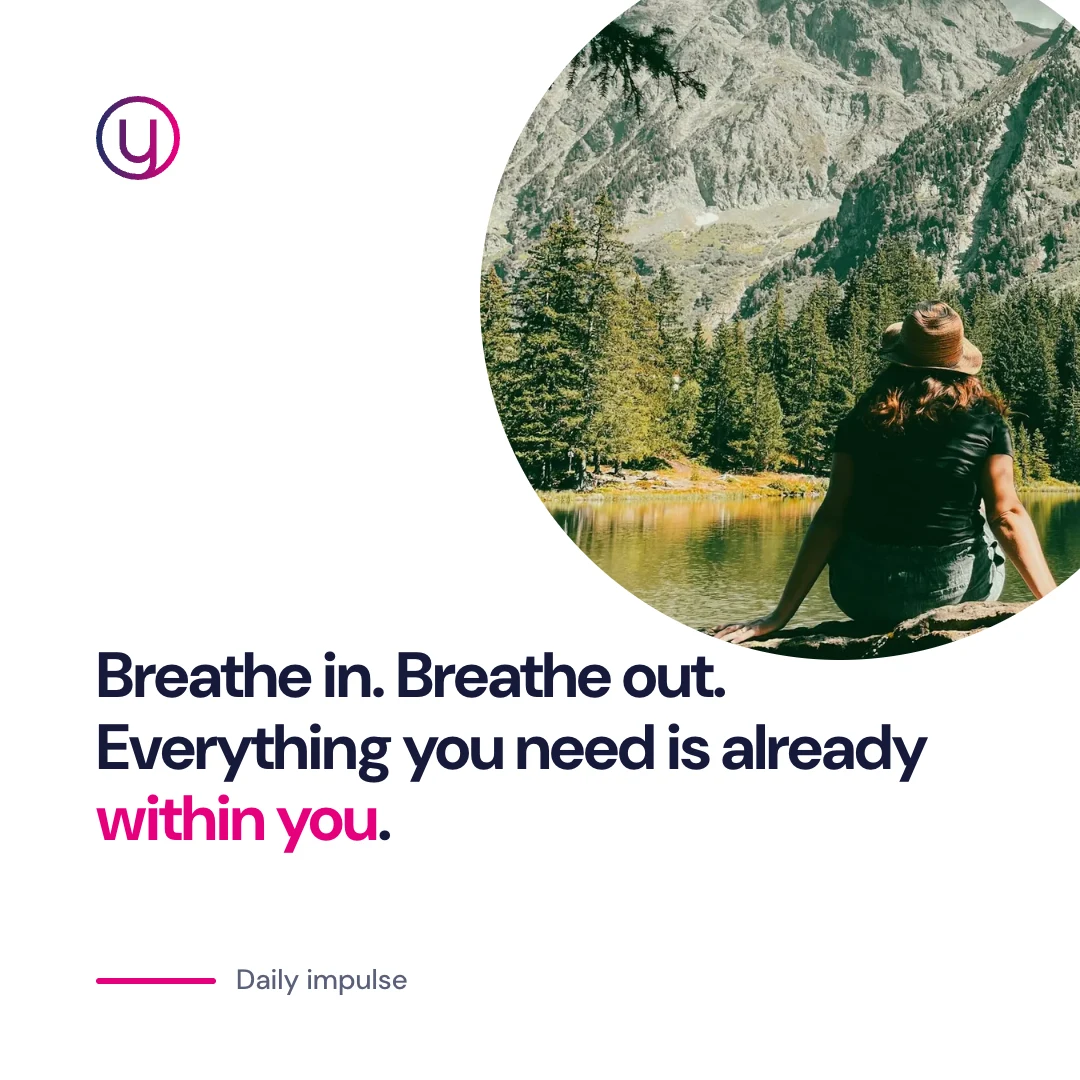
Daily impulse · 1080 × 1080 · photo cropped in a circle
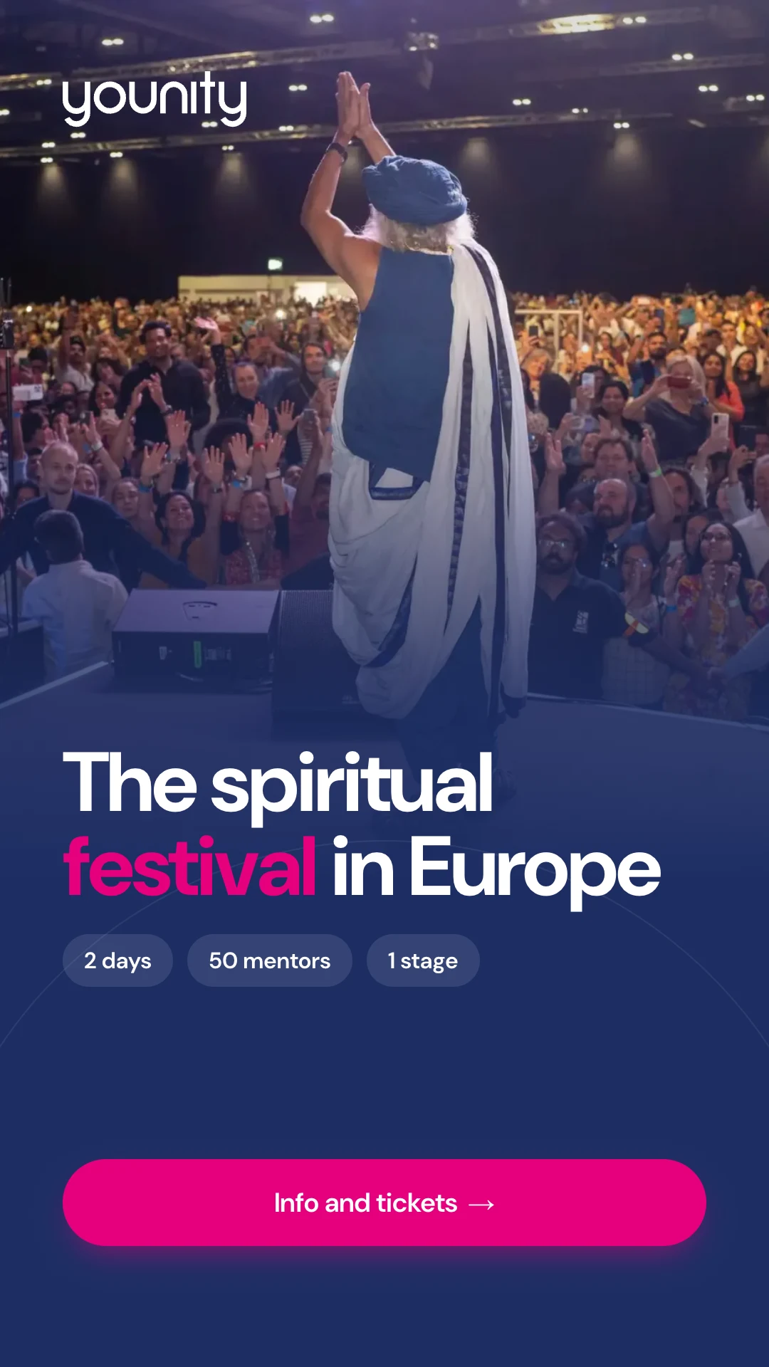
Story / reel cover · 1080 × 1920
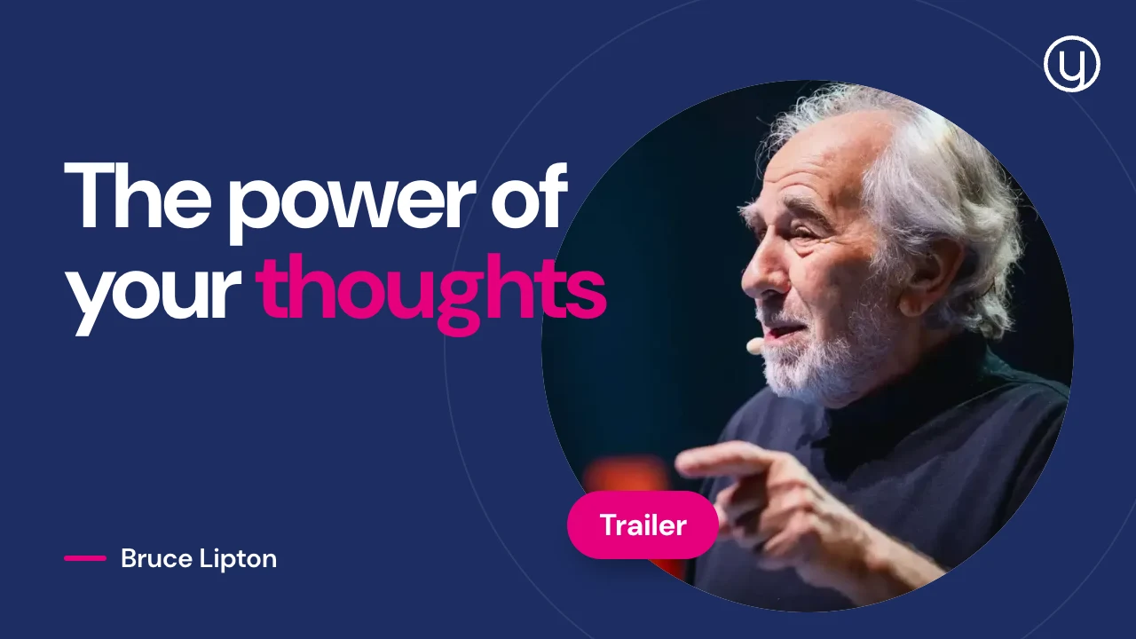
YouTube thumbnail · 1280 × 720
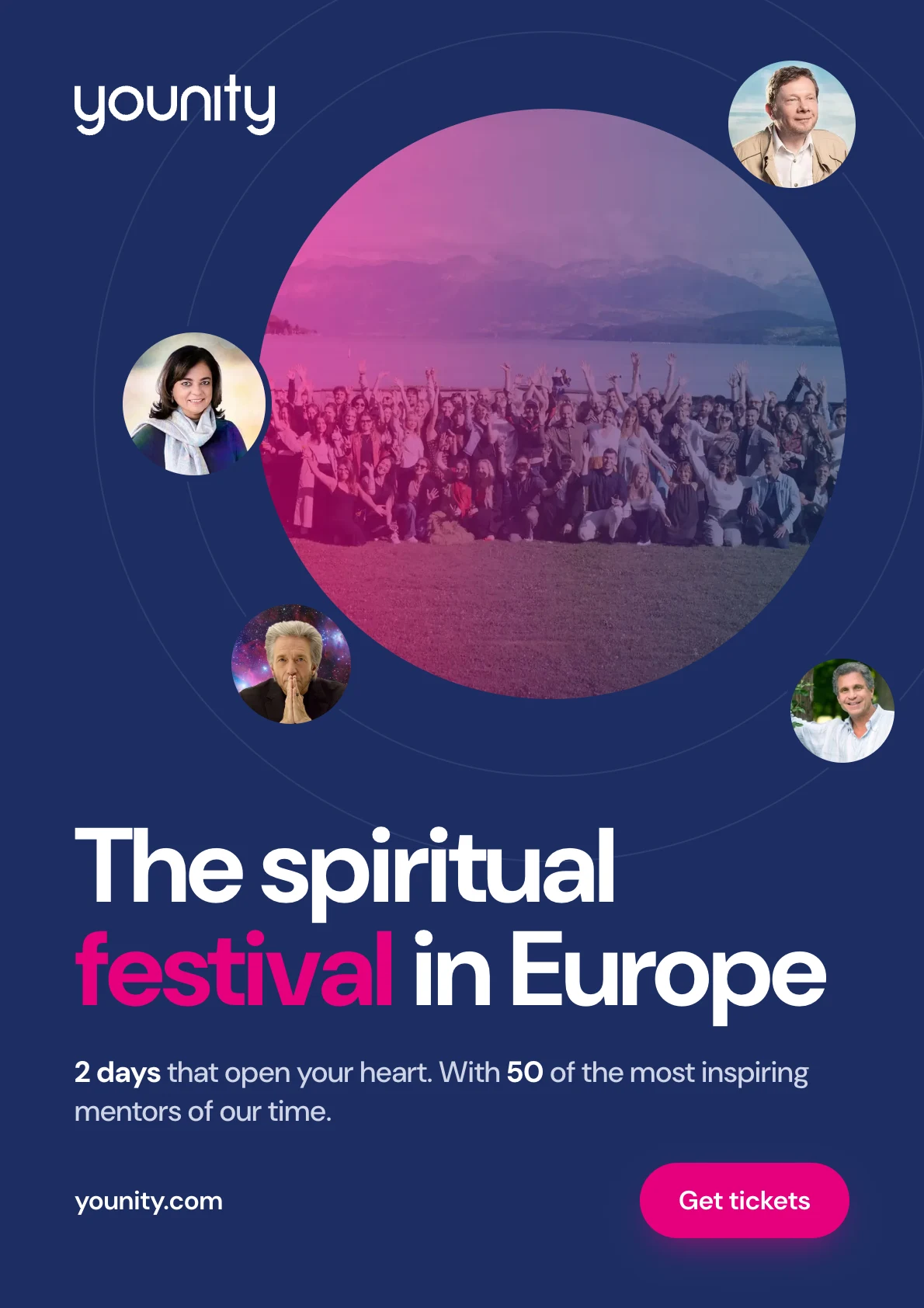
Poster · A2 portrait
A poster has two seconds. Space Blue as the surface, the orbit with mentors and a large headline make it younity at once.
Structure
Print files
The same principles apply to roll-ups, stage backdrops, tickets and badges: plenty of Space Blue, little text, one keyword in pink.
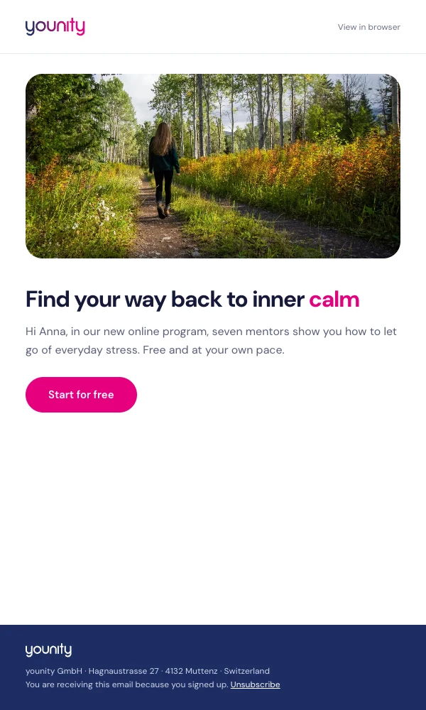
Newsletter · 600 px wide
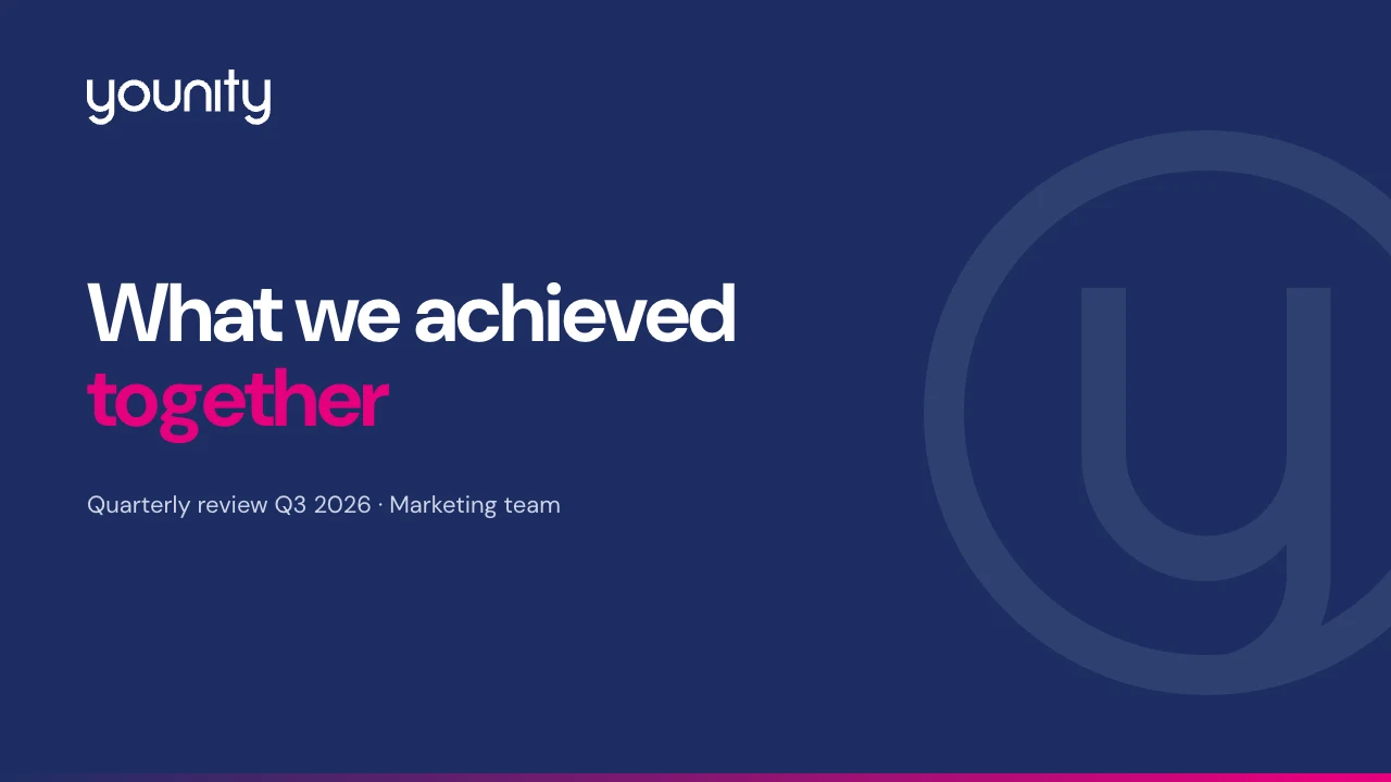
Ten questions before every publication.
All files are available for download in the online version of this guide.
Questions about the brand?
Anyone who deliberately breaks a rule makes that decision and informs the brand owner. New cases flow into the next version.
Versions
younity GmbH · Hagnaustrasse 27 · 4132 Muttenz · Switzerland · younity.com